


Background
For one of the client projects that I’m working on, we have multiple deployment environments up and running. At the last count we had five - local, development, qa, staging and production. However, with so many environments, I was finding it really difficult to differentiate between each of them as each website looks exactly the same. The only difference being a single word in the url:
I wanted to be able to immediately know which environment I was looking at. Meaning that I’d be able to tell each environment apart visually, and determine the environment if given a url by someone else. And this would also allow me to know how careful I should be - i.e. I’m can go mad on a local environment but will exert due caution on staging/production.
I took inspiration for how to solve this from my experience using Postico (a PostgreSQL client) in a previous team. Postico allows you to color-code each of your data sources - so the tab for our production connection was red and for development it was green.
I came up with the idea to change the color of the top navigation bar depending on the environment. After a bit of searching, the Stylish Chrome extension seemed to fit the bill. This extension allows you to customise a website through applying custom CSS styles over the top of existing styles.
Color-coding deployment environments using Stylish
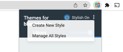
For each of my deployment environments I created a new style by selecting the ‘Create New Style’ option:
From there, you are taken to an ‘Add style’ page where you can specify your CSS:
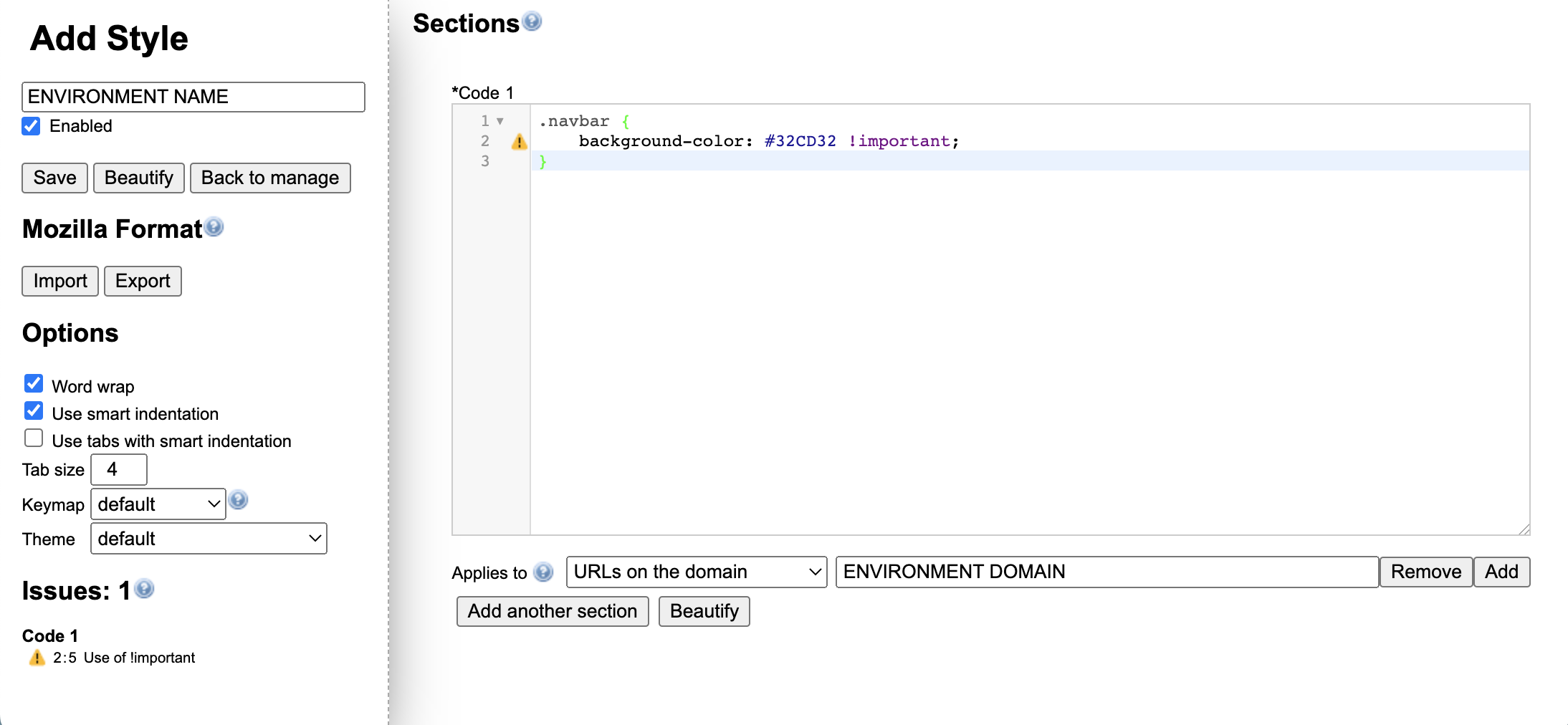
In our project, the top navigation bar has a class of navbar (super original 😛) so the CSS I added was:
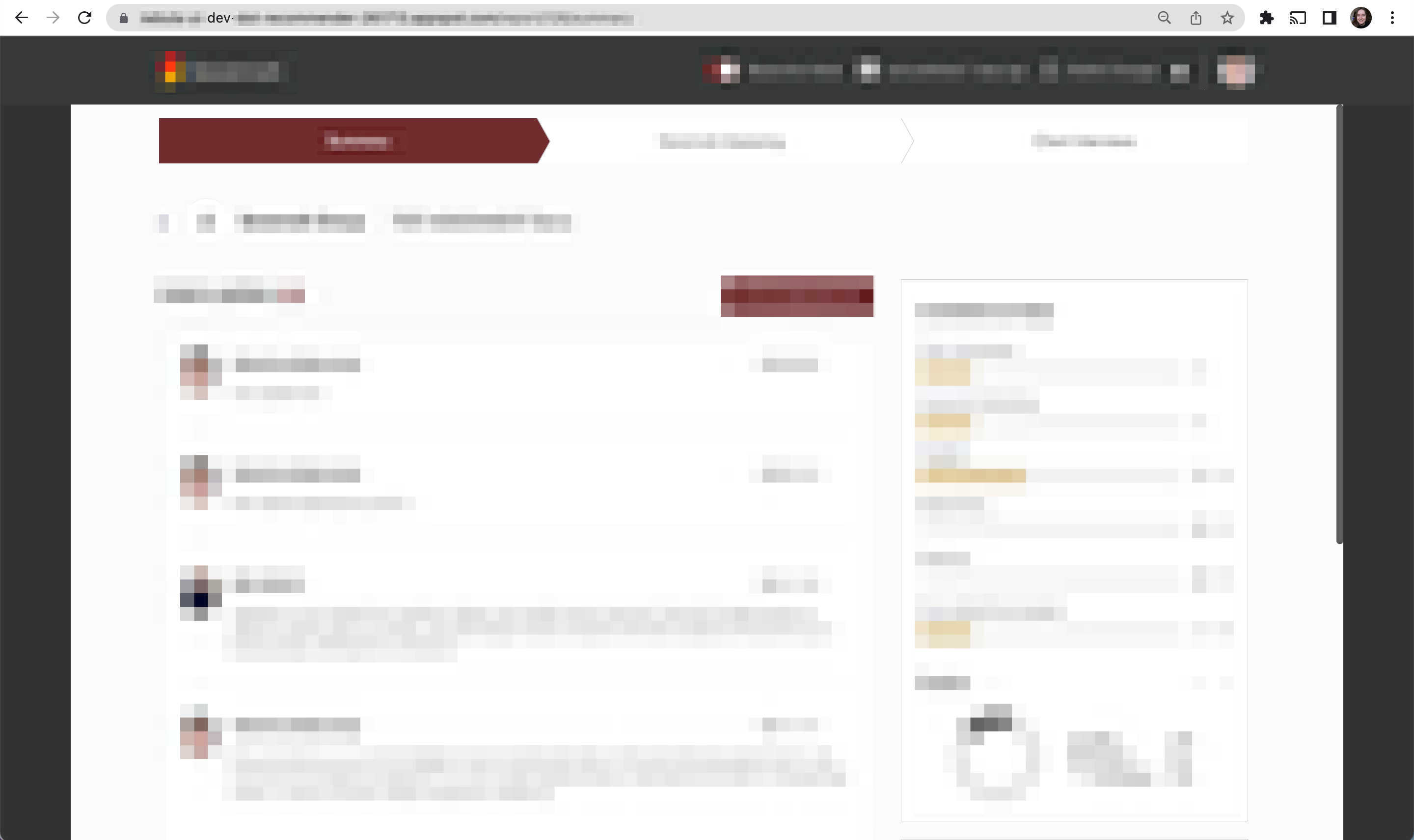
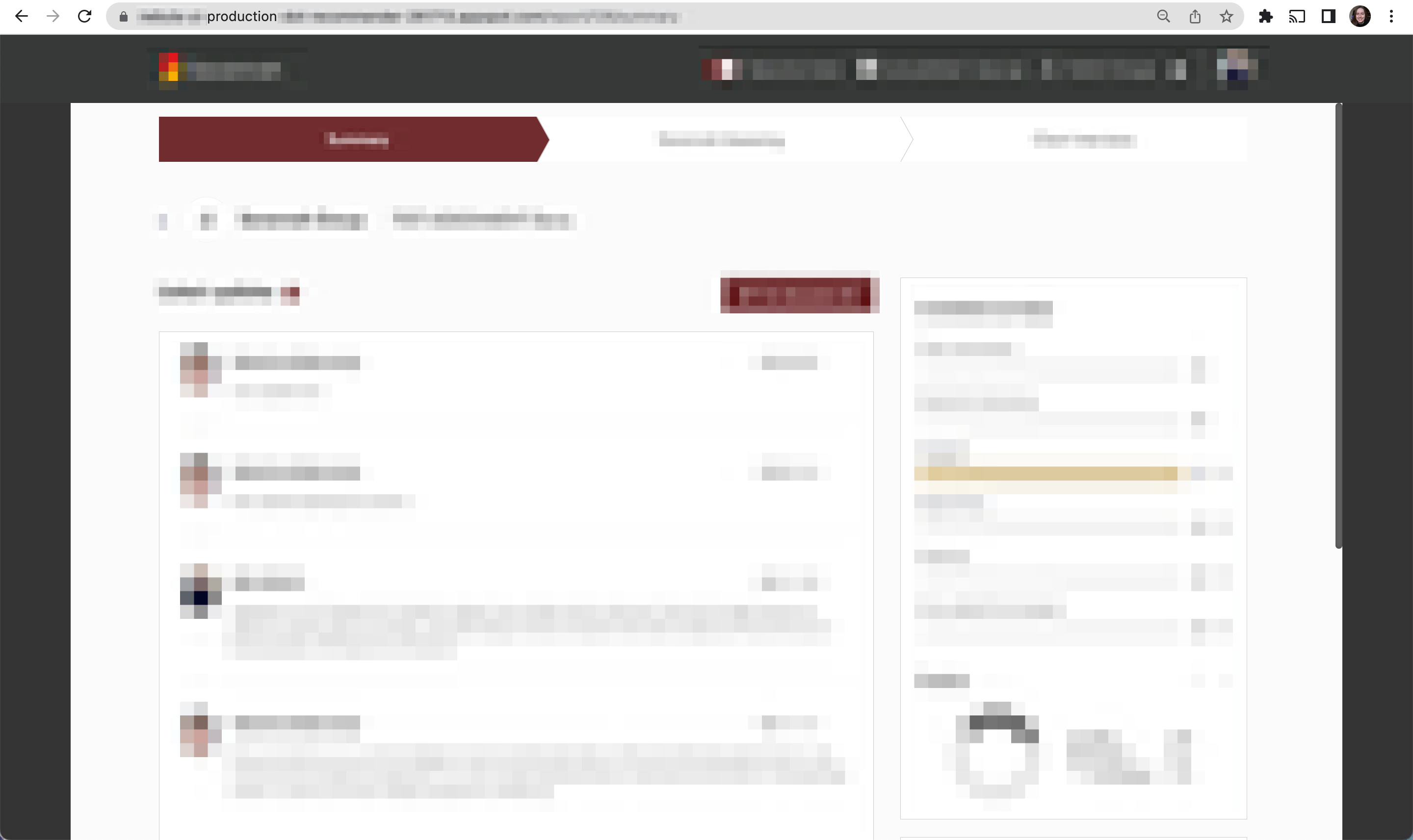
Where the COLOR placeholder is the specific color I wanted to use. For each environment, I limited the rule to only act on its domain using the ‘Applies to’ dropdown.
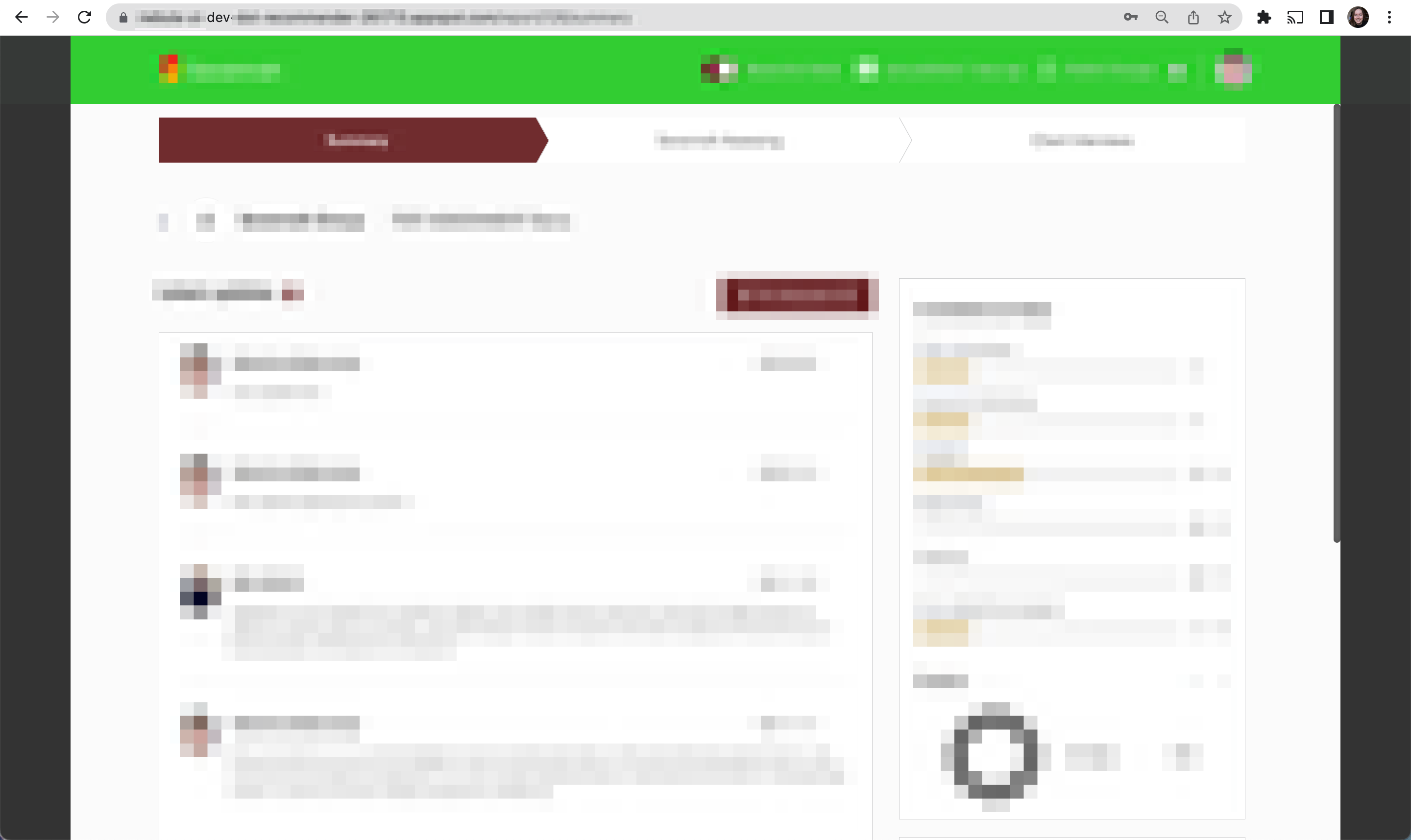
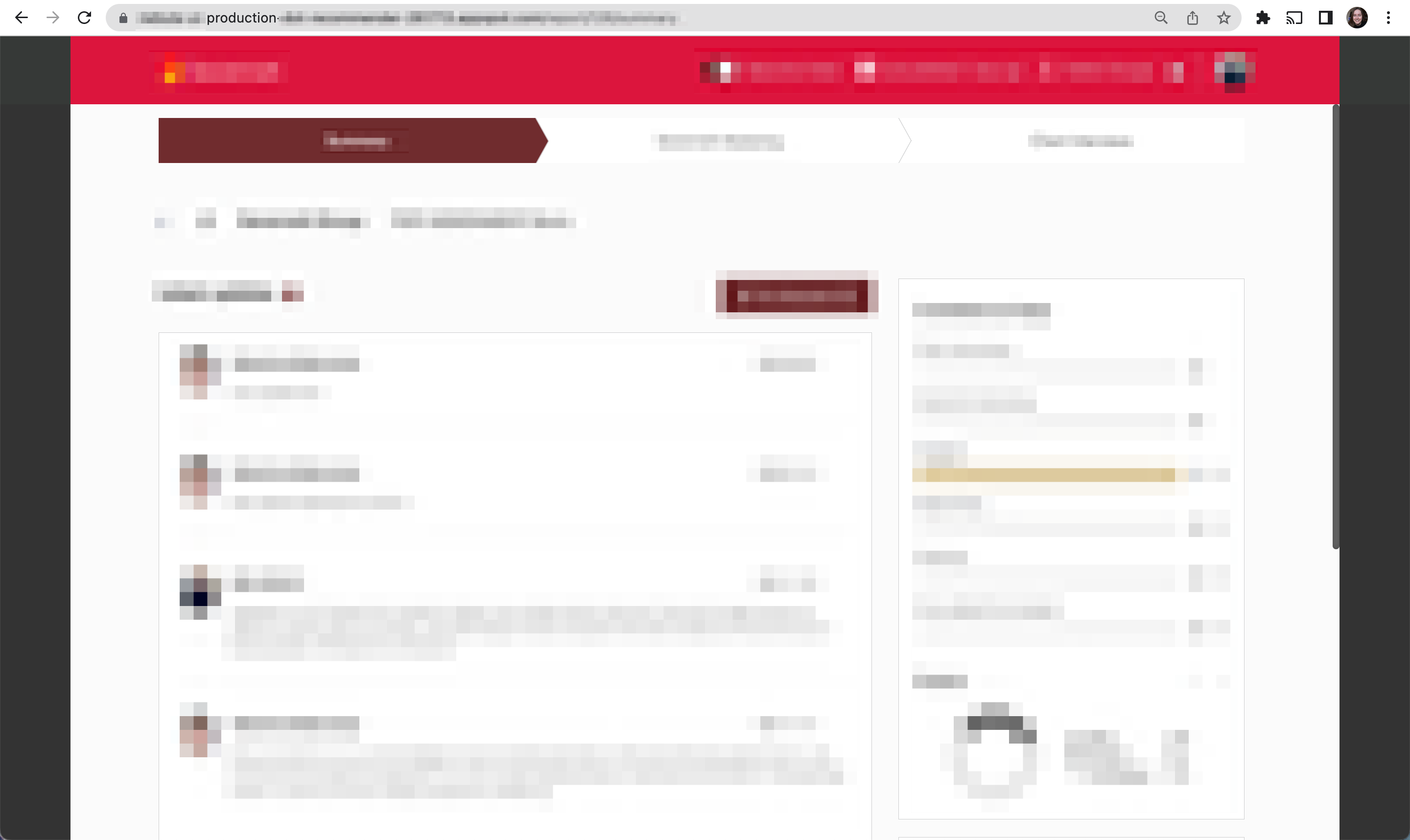
And the result looks like this:
For my local environment I took a slightly different tack. As I have the two repositories (FE and BE) running locally, I just changed the CSS file in the FE repo. I probably could’ve set up a new Stylish rule for local development but that would also mean that I could be potentially changing the color of navbars of any websites that I run locally 😊
Color-coding 3rd party dependencies
On a similar vein, we are using an important third party dependency in our project - for which there exists a non-production environment (sandbox) and a production environment.
I used Stylish again to change the header bar of this site to be able to know which of our deployment environments are pointing to the sandbox dependency and which are using the production dependency.

The CSS I used for the above looks like the following:
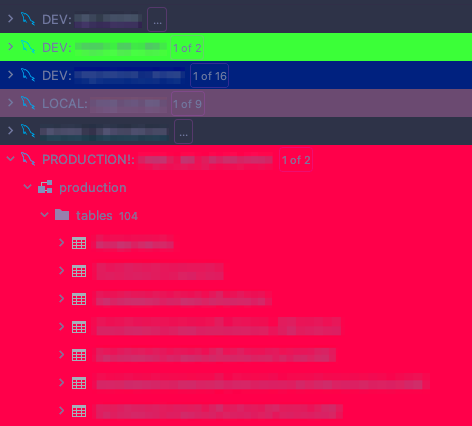
Color-coding database connections (using a JetBrains IDE)
To finish off this color-coding adventure, I wanted to color-code my database connections to match my deployment environments. I’m currently using the database management functionality in GoLand as my SQL GUI. Though I imagine all of JetBrains’s products function in much the same way:
Once a data source is added, simply right click on it and select ‘Color Settings’: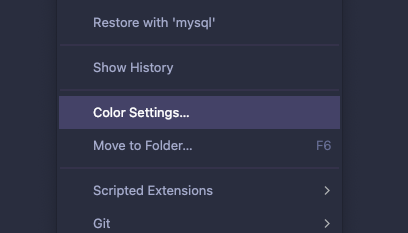
From there you can select your color, which will appear in various places - such as editor tabs and the ‘database explorer’.
And here’s what mine looks like:
Bonus: A Stylish rule for Pull requests
As a fun little project, I created a rule on Stylish to be able to easily determine which pull requests are mine on GitHub. Sometimes we have so many pull requests on the go at once that it’s not immediately obvious which belong to me!
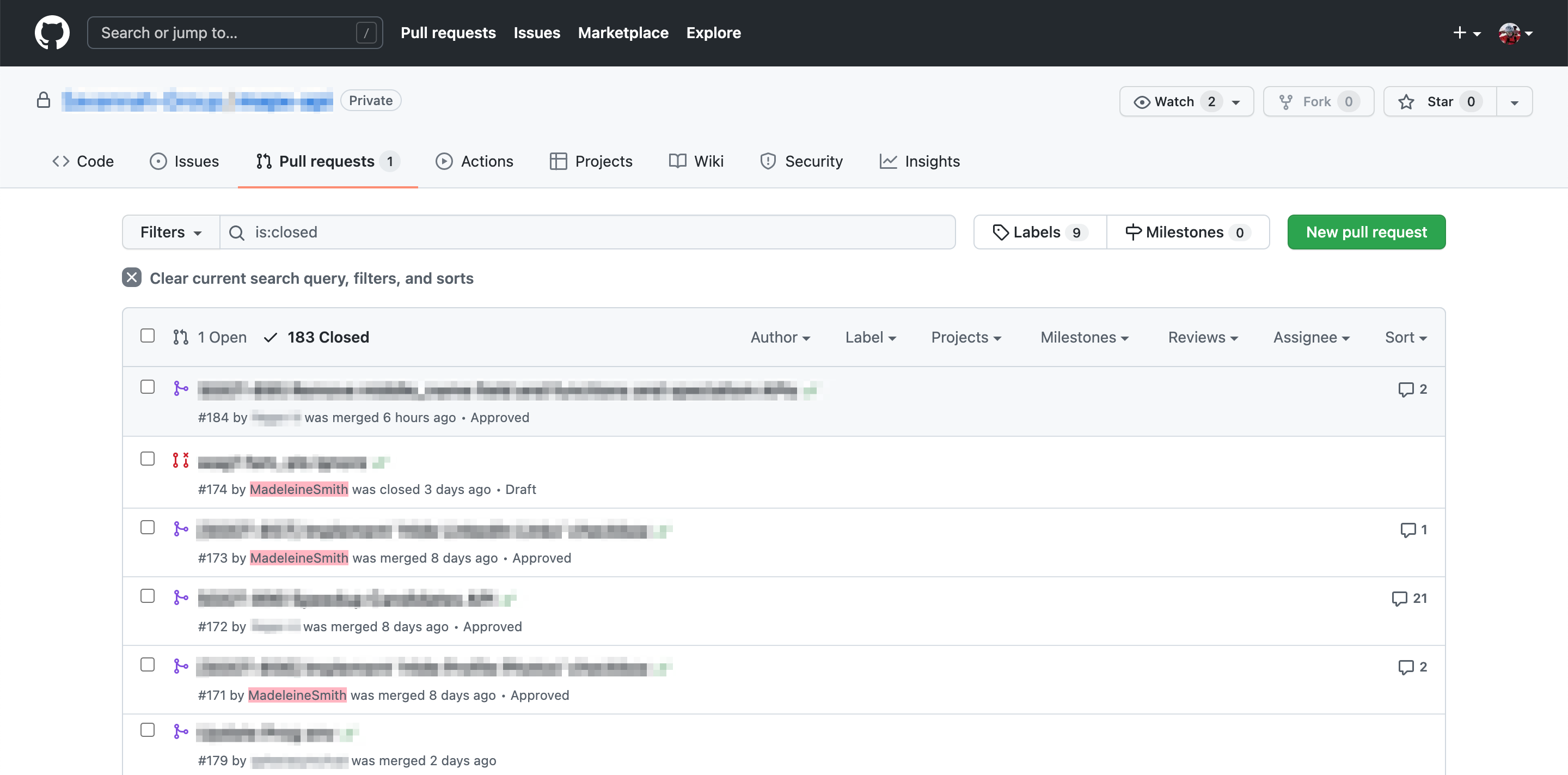
I initially wanted to highlight the whole div in question though I’m not sure this is possible with straight CSS (as you can’t ascend the DOM with a selector). So instead I settled for highlighting my GitHub username - which does the trick.
In need of a back-end engineer for your project? Get in touch to hire me for contract work 💯